
The strokes of the logotype emulate the different pressures of a child's finger interacting with a handheld device.

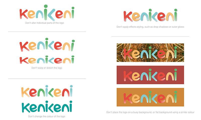
The logotype (logo) should always have room to breathe.
Using the following combination of the height of the ‘K’ and the ’n’ ensures that the logo has the necessary uninterrupted space.
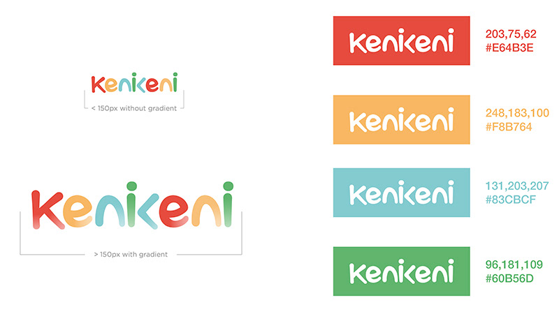
The Kenikeni logotype is custom-created lettering, and should never be replaced by a font or any other typeface.
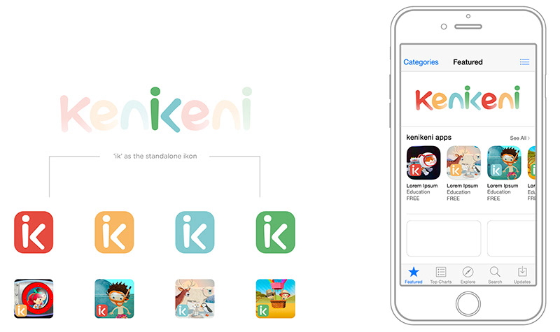
The (ik)on exists for small format requirements.
It helps the brand remain familiar and recognisable within the format of media such as handheld devices.
Kenikeni | Kannot